4 Tips for Organizing and Styling a Bookshelf
One great feature in our apartment is a huge built-in bookshelf in the living room. I was overjoyed to have it…and then totally freaked out. Let’s face it: Bookshelves are pretty intimidating! If you’re like me, you know a good bookshelf when you see it. But to actually start from scratch and style a good bookshelf myself? Where do I even begin??
Like any intimidating project, I’ve learned that successfully styling a bookshelf starts with a few simple guidelines. Here are some pointers that the experts talk about time and again:
1) Mix it up!
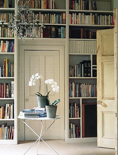
A mistake I see a lot – all of your books do not need to be lined up, sitting perfectly straight and vertical. In fact, it’s so much better to break everything up – some books placed vertically, some laying horizontally. And even better to stick a small bowl, picture frame or piece of pottery on top of the stack. Some examples of “mixing it up”, done right:
{ via CocoKelley }
Here’s my own attempt at placing some books horizontally, with a bowl placed on top:
Okay, not perfect, but nicer than a shelf jam-packed with books, don’t you think?
2) White Space is a Good Thing
So many of us think we need to fill up every square inch of a bookshelf. It’s something almost all of us do! But in fact, occasional empty space is pleasing to the eye.
Once I learned this, I removed a ton of books and *stuff* – and it really created some breathing room:
Above you’ll see that only a few books line this one shelf, stopped by a decorative bookend that I found at TJ Maxx. The rest of the shelf holds two framed photos. Ahhh, space…
Here are some other examples below! Below, I love that the top shelves only hold red pieces of pottery. Such nice breathing space:
These shelves are like art installations:
Ahhh, space!
3) Symmetry is the name of the game.
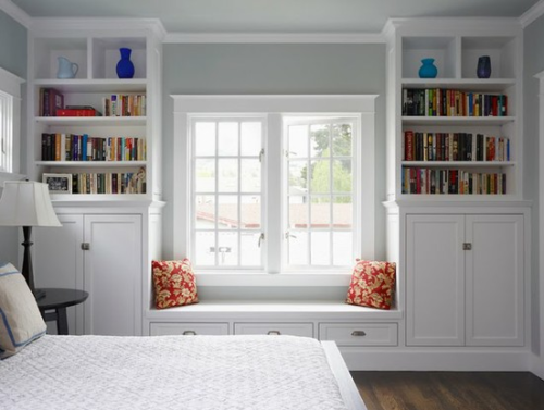
Your eye really does like to see symmetry! It makes all the difference. Here’s a great example below – books lined up according to height (in descending order from left to right), and stark blue vases perched on top. So calming and balanced!
The gold-framed prints in the picture below give the eye something to bounce off of – creating a pleasing equilibrium:
How adorable is this vignette below? In the living room of Michelle Adams, of Domino and Lonny.mag fame. Everything counterbalanced to create a great symmetrical effect:
{ Via Pinterest }
4) Keep it Interesting
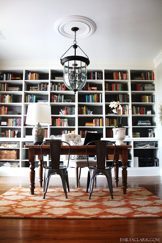
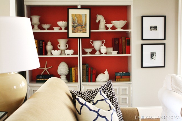
This last guideline is not a “must have” but a “nice to have”. Painting the back of your bookshelves really makes the books and art on your shelves pop.

{ via Emily Clark }
Another Emily Clark shot, love that red:

Even more fun, you could wallpaper the back of your bookshelves. Isn’t this picture below just great? I’ve also heard of people using fabric and even fun paper or gift wrap. Even renters like myself could use gift wrap as it wouldn’t be hard to remove in the future!

I hope these tips were useful and that you are inspired to get styling this coming weekend! I’m certainly getting inspired to make some changes…


 { via
{ via 


