Baby Girl Room: Before & After
Decorating a baby nursery or little girl’s room is a guilty pleasure – it’s the one place you can really lay on the cute factor!
For my daughter Caroline’s room, we went heavy on the pink & green, a color combo near and dear to my heart.
To give you a sense for what we started with, here’s the before photo:
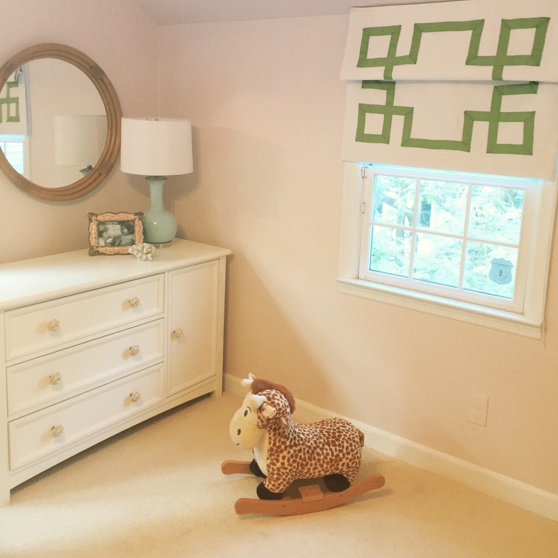
And here’s the after (from the same angle!):
The room is not 100% done – there’s a little zhushing that still needs to happen (a few accessories and wall hangings).
But it’s pretty darn cute at this point. And besides, I couldn’t wait any longer to share with you some of my decorating tips and tricks I used.
#1 Layered Rug
Even though the room already has wall-to-wall carpet, I think layering rugs is a really good idea in decorating. Makes a room feel whole. Hence the circular shag rug layered on top. (This one is from Home Goods).

#2 Moroccan Pouf for Insta-chic
Like that Moroccan pouf look? Don’t spend top dollar! I got mine at Overstock.com for less than $100. (You can read more about my search for discount Moroccan poufs here.)
 Greek Key fabric by Duralee
#3 “Grown up” accessories can complete a kid’s room.
You don’t usually see fake coral in a kid’s room, or a sophisticated lamp. But the unexpectedness of both makes the room more interesting. Not eveything has to be “little kiddo”.

(Coral, lamp and picture frame all from Home Goods!)
#4 Swap out those knobs!
I took a basic, boring kids’ dresser and popped on those adorable ceramic knobs from Anthropologie (swapping out knobs really is one of my favorite tricks):
#5 Spraypaint a light fixture.
This light fixture was all kinds of horrible. A million colors left it looking very “granny”. I found it in the clearance area of an online lighting shop (it was about $45). I spray painted the whole thing white and we now have this great “shabby chic” look as a result.
#6 Get your CUSTOM window treatments on Etsy.
Yes, it’s true. I ordered these custom roman shades from Etsy, complete with green grosgrain ribbon trim. They are a bit “homemade” looking, so if you’re looking for perfect lines and a totally polished presentation, they may not be for you. But I feel like that greek key pattern really makes the room, and I paid a fraction of what I would have paid for a “professional” grade custom window treatment.
Here’s the other side of the room, by the way, with the crib all decked out in more pink and green.
This side is a bit “blah” – needs something on the wall. I actually have my eye on this Flamingo from the Animal Print Shop, to place over the head of the crib:

Speaking of cribs, here’s the little baby doll crib that I decked out using Caroline’s old crib bumper.
Clever, right? You can see my how-to video here – it literally took me 15 minutes!

Hope you enjoyed this little before & after peek. I’ll let you know if I ever get my act together to hang that flamingo art!


Karlene
April 20, 2015 at 11:31 PMNice soothing color of pink with the punch of green….lovely!