In Search of The Perfect Kitchen Lantern
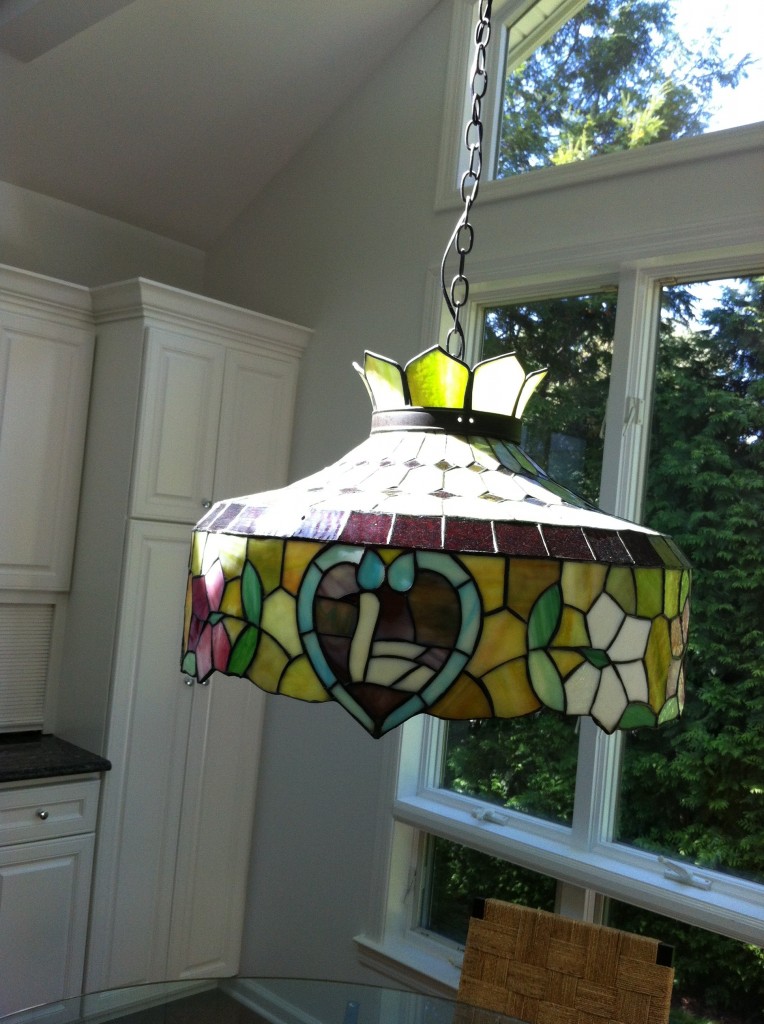
I am in serious pursuit of a new pendant light for our kitchen. Here’s the one we inherited from our house’s former owners…
Now, don’t get me wrong, there are plenty of lovely rooms that boast a nice Tiffany lantern. But this look doesn’t belong in my new kitchen!
So, there I was, surfing the Real Simple website one night in search of good organization tips, and BAM! I stumbled upon the kitchen light of my dreams! Here it is:
This is it – this is the light I want! A beautiful, shiny chrome pendant lantern. Sadly, after scouring the internet trying to find this puppy, I found it was sold by an interior designer on 1stdibs.com – meaning it was one-of-a-kind and likely an antique. *sob*
Okay, time to let go and start from square one…
I really like this lantern – the very square, pared down look is quite popular right now. Everyone from Restoration Hardware to Ballard Designs has options like this. But it seems just slightly too modern (and maybe a little too bare) for my space.
Savannah Aged Pendant, Arteriors Home
Here’s a fun take on that square, and I think the layered boxes make for an interesting look! But the mixed metals just doesn’t do it for me. Why oh why doesn’t this come in polished nickel?
Isn’t the one below lovely? But same issue as above – I really have my heart set on a polished nickel or chrome…

Bolton Oversized Lantern, Pottery Barn
Loving this Chinoiserie look, but it turns out this lantern is teeny – won’t pack enough punch for my big space and vaulted ceilings. But isn’t it cute? Maybe I could find another space for it…
Stanton Brushed Nickel Foyer Pendant, Bellacor
The “rounded” pendant lantern is also really in right now…
Piedmont Foyer Lighting, Progress Lighting
Edwardian Entry Lighting, Circa Lighting
This one is great, not totally square and not totally rounded… but again may be a bit too traditional for my tastes.

Winslow Square Lantern, Vaughan Designs
At one point I thought I might go in a totally different direction! This Orbit light is super modern and very trendy right now (think Restoration Hardware catalogue). But if I were to purchase it, I have to be honest I would lob off that orb thing hanging down on the bottom of the light. I just think it’s a bit too much.
Orbit Chandelier, Milieu Home Goods
So, after all that searching and pinning (and whining!), I think I may have found THE light.
Ta-da! The Large Cornice Lantern, in all its glory:

Large Cornice Hanging Lantern, Circa Lighting
This is what it looks like in “real life”. But this is actually the small version and I was thinking about going for the – POW! – extra large version.

Here’s the extra large version, in an antique black…

What would you do if you were me? Would you go super traditional? Edgy modern? Is an oversized lantern simply too weird for my space? Thoughts? Comments? Do tell!


fran
October 2, 2012 at 5:19 PMGo bigger, you will be glad you did……..Love the Lantern.
Amber
March 13, 2014 at 10:58 PMHey! I realize this is really, really late, but just found the light you originally wanted at Remains lighting!! It’s the Mercer 17 lantern.
http://www.remains.com/all/ceiling/lantern/hl2891.17/mercer-17-lantern.html?item=56&since=0&order=3
Lorri
March 16, 2014 at 2:33 PMthis is amazing! Thank you!! I can’t tell you how hard I looked for this lantern!